一只宋锦纹漆器礼盒,为什么适合送给重要的人
韵和鸣 · 韵和鸣公众号 · 2026/10/6 12:00:00 · 3 阅读
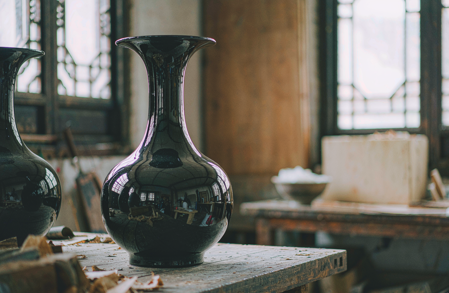
送礼最难的不是花钱,是"选得对"。一只宋锦纹漆器礼盒,或许能回答一个具体的问题:什么样的礼物,经得起郑重对待。
▍先说"送"这件事
送一份贵重的礼,难在哪儿?不在价钱,在于你想说的那句话,对方能不能接住。
贵而无心的东西,收下也只是收下;一件真正被记住的礼,往往有一个能被慢慢讲出来的来处。
所以挑礼物,挑的其实是"能不能被讲"。一只能被讲清楚来处的盒子,先就有了分量。
也有人习惯在盒里放一张手写的卡片。字不必好,把来处写清楚就行——器物负责体面,卡片负责交底。
礼物其实是关系的凭证。它不必贵,但要站得住:多年以后再看,还能想起当时的人和事。
▍两种老手艺,怎么装进同一个盒子
宋锦纹漆器礼盒,名字里其实藏着两门手艺。
"漆"是平遥推光漆器髹饰技艺,国家级非遗,产在山西平遥;"宋锦"出自江苏苏州,也是国家级非遗,以纹样设计见长。一个在器身上,一个在纹样里,合起来才是一只完整的盒子。
品牌做的"锦盒"系列,走的正是"锦漆共生"这条路:不是把两种元素硬拼在一起,而是让纹样和漆面各退一步,互相衬着。
这一类器物,也和苏州丝绸博物馆有过联动。器物与博物馆的关系,其实是"同源"两个字——都从老手艺里来。
盒形也要合手。太大显阔,太小局促;开合的手感、盖与身相扣的那一下松紧,都要试过几版才定得下来。
▍宋锦的纹样,为什么耐看
锦这个东西,贵在"织",不在"印"。
纹样是被织进经纬里的,所以它有厚度,也有暗光。凑近看,线条是一根根丝线垒出来的;退开看,它又安静成一片底。
宋锦的纹样多取几何与花鸟,讲究"铺得开、收得住"。它不喧哗,正好配漆器那种克制的光。
印上去的图案,一眼就看完了;织进去的纹样,得看第二眼、第三眼。留白多,反而经得起反复看。
送礼怕俗,多半就怕"太响"。纹样安静,礼才显得稳。
盒内外还讲究搭配。盒面多取一种纹,盒内衬另一种,主次分明,开合之间才有变化。
摸上去,锦与漆是两种手感:锦面细密,漆面温润。放在同一只盒子上,一硬一软,刚好互补。
▍漆面那层光,是从哪儿来的
盒子的下半场,是漆的功夫。
大漆不像油漆那样一遍成型,它是"叠"出来的。一遍漆、一遍阴干,再一遍;层数不够,光就浮;层数够了,才有那种沉下去的亮。
收尾的一道是推光。不用布,用手掌,一遍遍推磨,直到漆面能照见人。这道工序急不得——手上用力不匀,光就是花的。
所以一只漆盒的"亮",不是刷出来的,是磨出来的。它也不怕被看——凑近、退开,光都很稳。
大漆还有一点别处少有:它经得起反复擦拭。日子久了,拿一块软布顺着纹路轻轻擦一遍,光又会回来。
▍为什么"重要的人"适合它
"重要的人"有很多种:提携过你的长辈,一起扛过事的伙伴,或者你自己。
这类人的共同点,是懂"慢"。他们多半见过好材料,也碰过好手艺,礼物能不能过关,一看便知。
漆器礼盒的好处,正好在这里:它不怕被看,越看越有东西。漆面要一层层推出来,纹样要一梭梭织出来,这两件事都急不得——一份经得起琢磨的礼,本身就是一种尊重。
它还能用。首饰、印章、茶器,装得下;摆在案上,也是一件物。礼物从"看过"变成"用过",关系才有了落脚的地方。
还有一层:它体面,却不张扬。过重的礼会让人为难,过轻的又像敷衍;一只用得上的器物,恰在中间。
▍一只盒子,为什么经得起放
礼物有"用完就完"的,也有"放着也值"的。
漆器属于后者。它不怕岁月,反倒是时间会给漆面再添一层温润的光,行内把这叫"包浆"。放上几年,颜色会沉,手感会更顺。
这一点对"重要的人"格外合适:一份不太可能被随手丢掉的礼,才算真正送到了。
▍收束
好的礼物,是替你把话说清楚的那一件。它不替你承诺什么,只是安静地站在那儿——懂的人,自然会懂。
下一次给重要的人挑东西,不妨先问一句:它经不经得起被放很久。
你收到过哪件让你一直留着的礼物?留言聊聊。
📩 非遗项目 | 匠人举荐 | 跨境出海 | 线下联营
欢迎留言或后台联系,我们与匠人同行。
—— 韵和鸣 · 与匠人同行
〖 器 〗
English
Where is the difficulty in giving an important gift? Not in the price, but in whether the other person can catch the sentence you mean to say.
Expensive but heartless things are merely received; a gift that is truly remembered tends to have an origin that can be told slowly.
So choosing a gift is really choosing whether it can be told. A box whose origin can be explained clearly carries weight from the start.
Some also tuck a handwritten card into the box. The hand need not be fine; making the origin clear is enough—the object carries the grace, the card does the explaining.
A gift is, in truth, a token of a relationship. It need not be costly, but it must hold up—so that years later, it still recalls the person and the moment.
The name of a Song brocade lacquer gift box hides two crafts.
The "lacquer" is the Pingyao polished lacquerware decoration technique, national-level ICH, from Pingyao, Shanxi; the "Song brocade" comes from Suzhou, Jiangsu—also national-level ICH—known for its pattern design. One on the body, one in the pattern; together they make one whole box.
The brand's "brocade box" series walks exactly this path of "brocade and lacquer in symbiosis": not forcing two elements together, but letting pattern and lacquer each yield a step, each setting off the other.
Such objects were also linked with the Suzhou Silk Museum. The relationship between object and museum is, in fact, the word "common origin"—both come from old craft.
The box's form must sit right in the hand. Too large and it shows off; too small and it feels cramped. The feel of opening and closing, the snugness as lid meets body—all must be tried in several versions before settling.
Why Song Brocade Patterns Withstand Looking
Brocade's value lies in weaving, not printing.
The pattern is woven into warp and weft, so it has depth and a hidden sheen. Up close, the lines are piled from threads; from afar, it settles into a quiet ground.
Song brocade patterns draw mostly on geometry and flowers-and-birds, and value spreading out and holding back. It makes no noise—just right for the restrained sheen of lacquerware.
A printed design is taken in at a glance; a woven one asks for a second look, then a third. More empty space, and it bears looking at again and again.
A gift fears being tacky, which usually means it is too loud. A quiet pattern makes a gift look steady.
Inside and out there is also a pairing. The lid usually takes one pattern, the lining another—primary and secondary kept clear, so that opening and closing the box offers a change.
To the touch, brocade and lacquer give two different feels: the brocade fine and close, the lacquer warm and smooth. On one box, one firm and one soft, they complement each other.
Where the Sheen on the Lacquer Comes From
The box's second half is the work of lacquer.
Raw lacquer does not set in one pass the way paint does; it is built in layers. One coat, one spell of drying, then another. Too few layers and the light floats; enough layers and you get that sheen which sinks in.
The finishing step is hand-polishing. No cloth—just the palm, worked over and over until the surface can mirror a face. This step cannot be rushed: press unevenly and the light comes out mottled.
So a lacquer box's brightness is not painted on but polished out. Nor does it fear being examined—up close or from afar, the light holds steady.
Raw lacquer has one trait few materials share: it takes repeated wiping. Over time, run a soft cloth gently along the grain, and the sheen returns.
"Someone important" takes many forms: an elder who once lifted you up, a partner who carried things with you, or yourself.
What they share is understanding "slow." Most have seen good materials and handled good craft; whether a gift passes muster, they know at a glance.
The merit of a lacquer gift box lies right here: it does not fear being examined—the more you look, the more there is. The lacquer surface is polished layer by layer, the pattern woven shuttle by shuttle; neither can be rushed—a gift that withstands scrutiny is itself a form of respect.
It is also usable. Jewelry, seals, tea ware all fit; set on a desk, it is an object in itself. When a gift turns from "seen" to "used," a relationship gains somewhere to rest.
One more layer: it is presentable without being loud. Too heavy a gift embarrasses; too light a one seems careless; an object that can be used sits exactly between.
Some gifts are done the moment they are used; others hold their worth simply by being kept.
Lacquer belongs to the latter. It does not fear time—rather, time adds another layer of gentle sheen to the surface, which those in the trade call baozang, a patina of handling. Left for a few years, the color deepens and the feel grows smoother.
This suits "someone important" especially well: a gift unlikely to be tossed aside is one truly delivered.
A good gift is the one that speaks clearly on your behalf. It promises nothing for you; it simply stands there quietly—those who understand will understand.
Next time you choose something for someone important, ask one question first: will it bear being kept a long while?
ICH Projects · Artisan Referrals · Global Distribution · Salon Partnerships
你可能还感兴趣
一件漆器该有多重,手感不会说谎
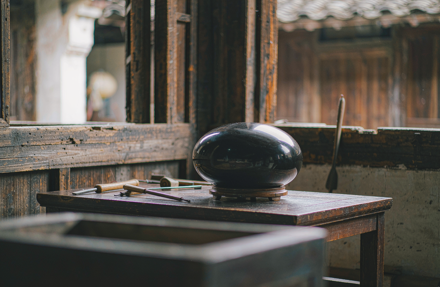
严选器物,看纹样、看款识、看证书,都是明面上的事。但有一道标准写不进任何参数表——上手。同一尺寸的两只漆盘,一只压手温润,一只轻飘干瘪,差别从何而来?这次把"分量"这件事拆开讲。说到底,重量是工序的记账本。
韵和鸣 · 2026/10/14 · 14 阅读
一件非遗手作凭什么"值":把时间的账算一遍
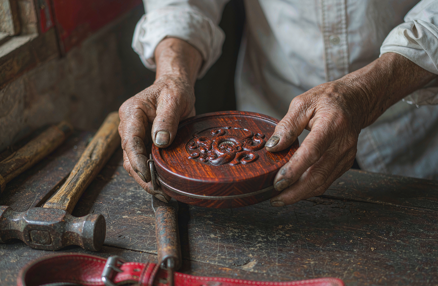
谈非遗手作,绕不开一个字:值。有人觉得贵得离谱,有人觉得便宜得可疑。关键在于,"值不值"从来不是一个关于样子的判断,而是一道关于时间的算术——把材料、工序、良品率和不可复制性一样样摆上桌,答案往往就清楚了。
韵和鸣 · 2026/10/9 · 11 阅读
一面屏风,如何成为一个家的「眼」
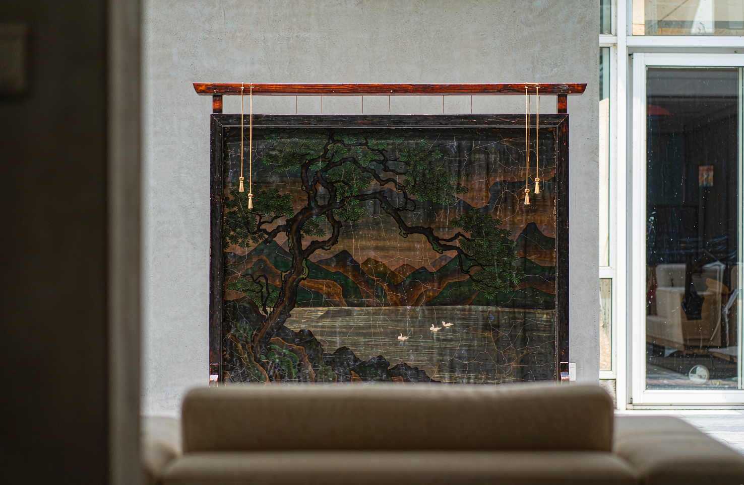
老房子里,屏风从来不只是挡一挡。它决定你一进门先看哪里。四面墙的屋子有了屏风,才像有了一个"眼"。
韵和鸣 · 2026/10/8 · 11 阅读
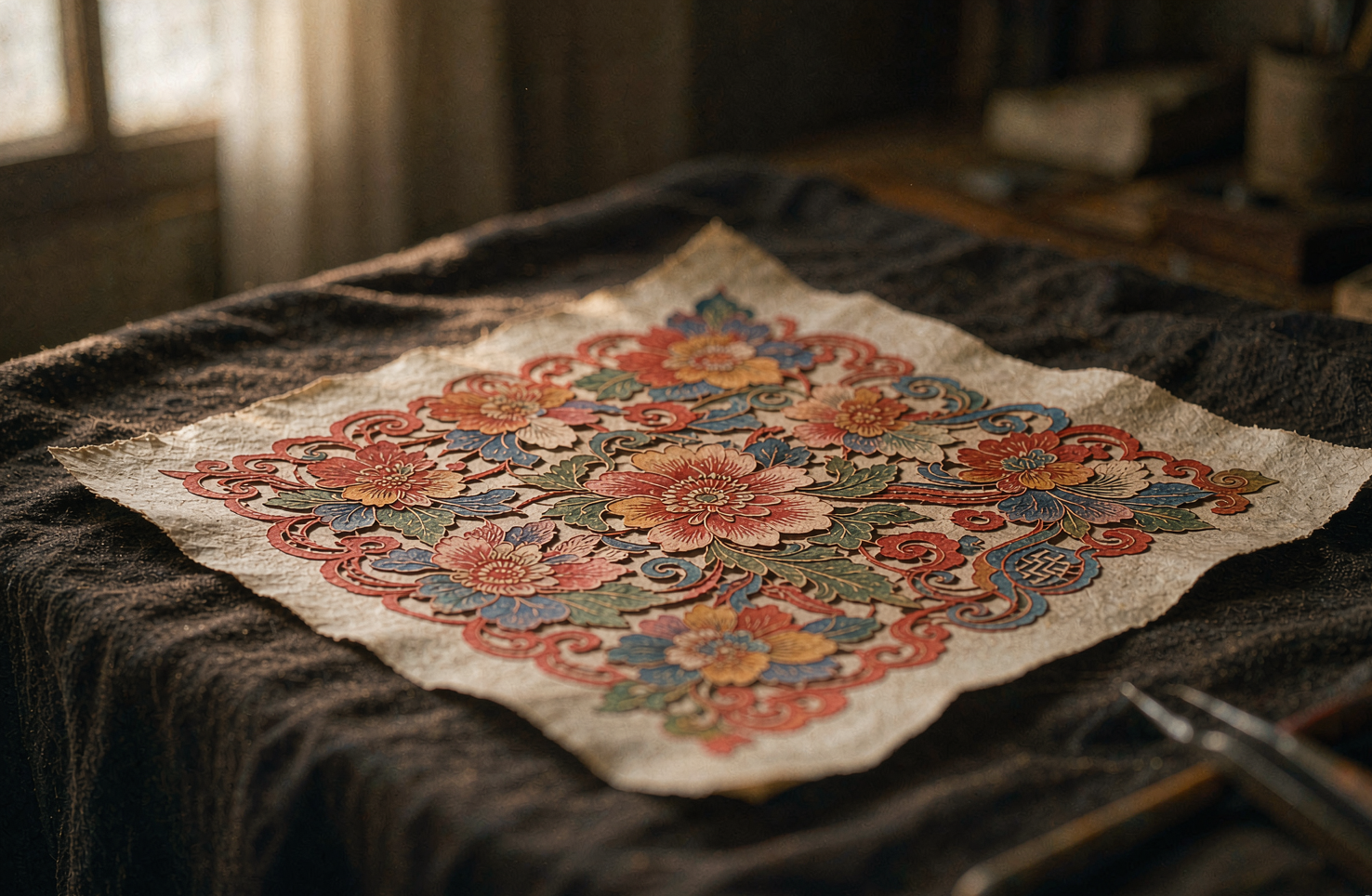
一张蔚县剪纸,彩色的刻刀活
严选录这一期看一张不太一样的剪纸:它不用剪刀,用刻刀;不止红色,还带着点染出来的粉与绿。河北张家口蔚县的剪纸,是剪纸大家族里"反着来"的一支——别处以剪为主、以红为正,蔚县以刻代剪、以点彩上色。说到底,这两个"反着来"的本质,是蔚县人把剪纸从窗前的女红,做成了作坊里的分工手艺:看懂了这一点,才算看懂了这张纸。
韵和鸣 · 2026/10/13 · 10 阅读
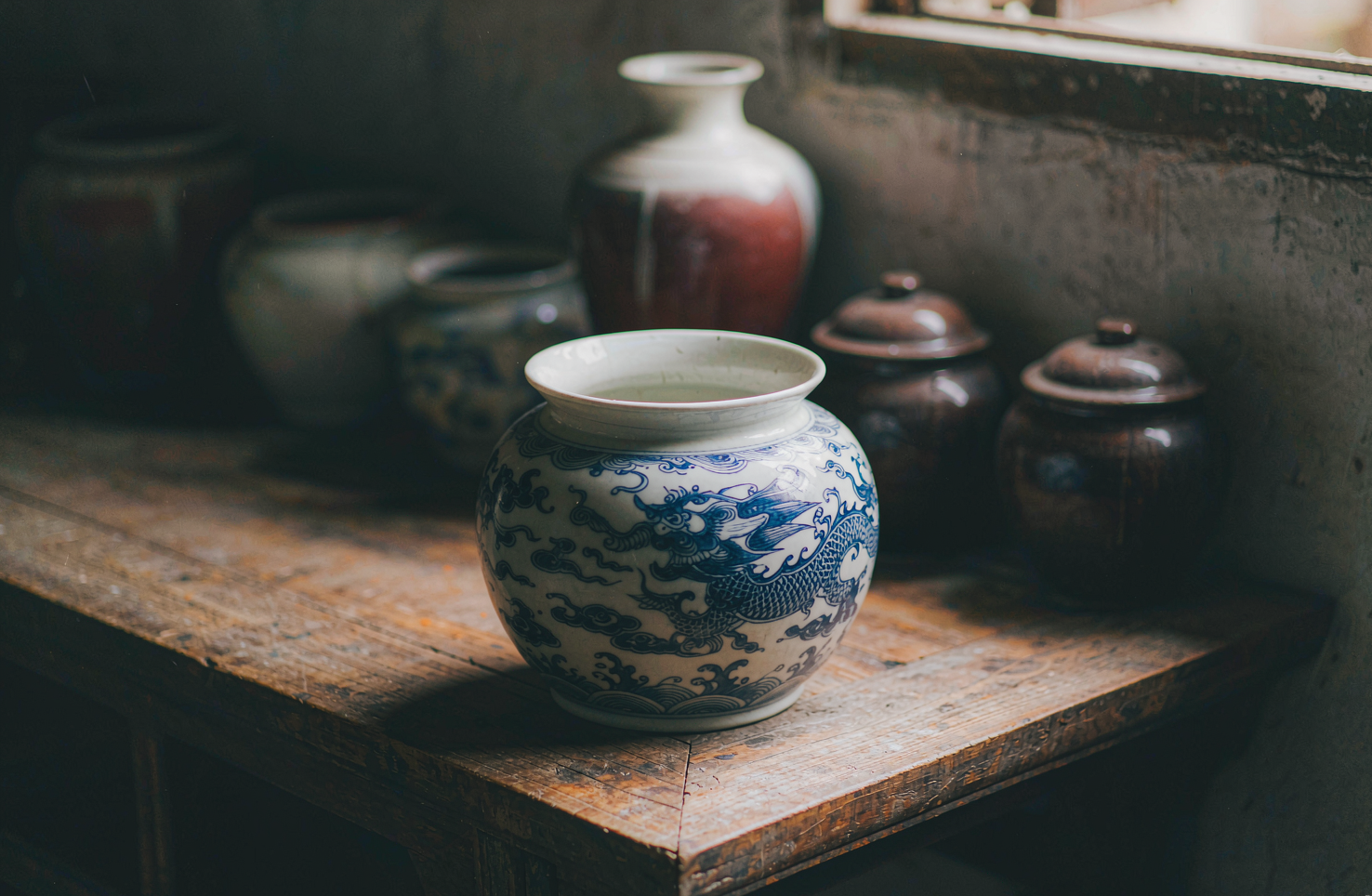
一盏博山琉璃:颜色是炉火给的,不是颜料调的
说到底,琉璃与玻璃的分界,不在透明不透明,而在颜色从哪来。在山东博山,一盏鸡油黄琉璃的颜色长在料里、生在炉里,出炉之后再不改色。这是严选录这一期想讲清楚的事。
韵和鸣 · 2026/10/12 · 9 阅读
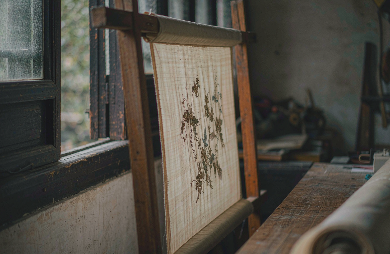
一枚苏绣绣片,丝光里藏着多少根丝
看一枚巴掌大的苏绣绣片,凑近了看,再凑近一点。你会发现它的光不是绣上去的,是"长"出来的——丝被劈到几乎看不见,一针一针顺着一个方向排,光就顺着丝走。说到底,苏绣的讲究,是从把一根丝线"拆开"那一刻开始的。
韵和鸣 · 2026/10/11 · 9 阅读