青花与漆:一只茶器上的两种时间
韵和鸣 · 韵和鸣公众号 · 2026/10/4 12:00:00 · 3 阅读
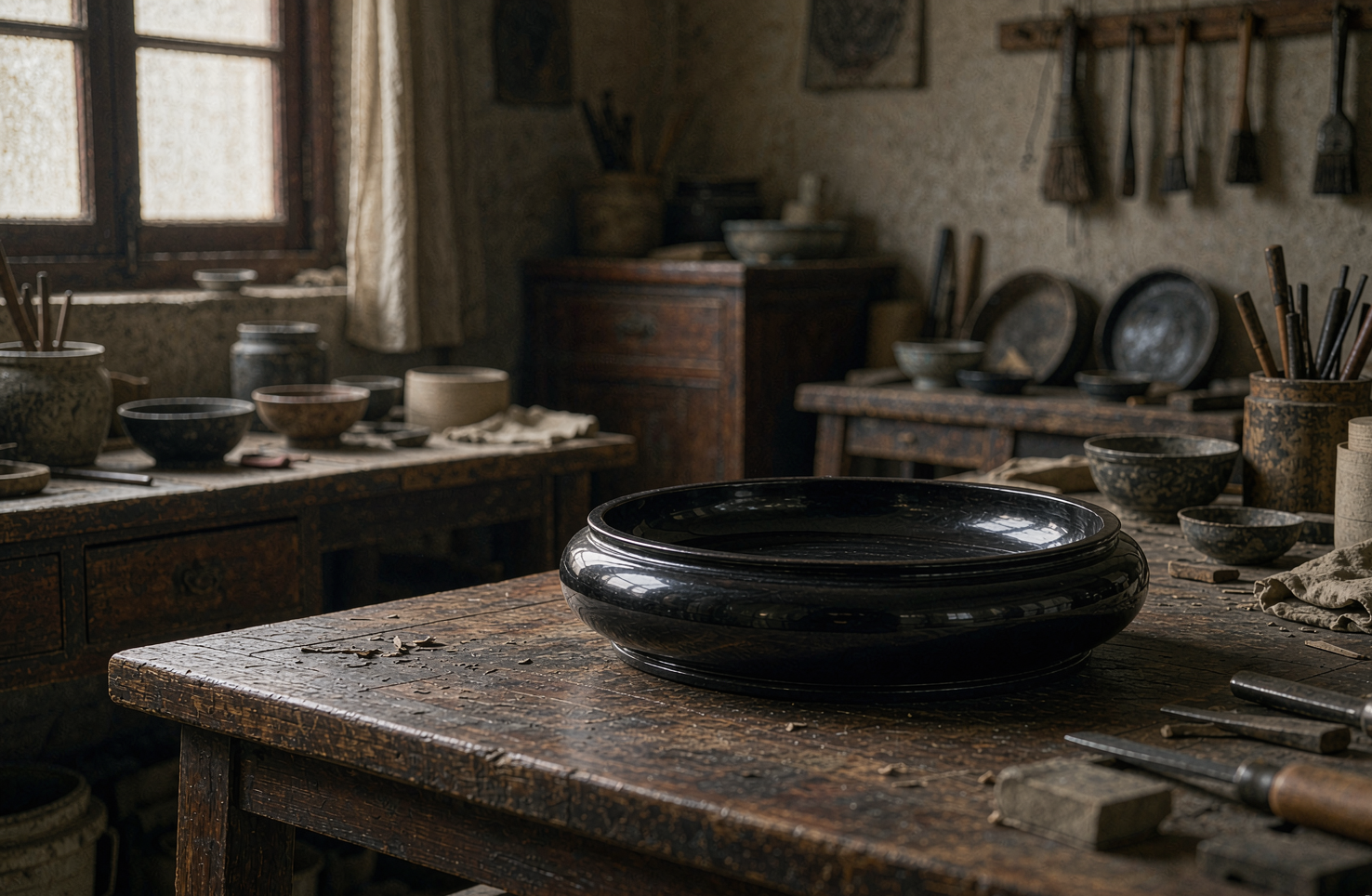
一只茶盏,白的胎上走着青的花;盏托与盏盖,却覆着一层温润的漆光。两种材质,两种时间,在一件器物上遇见了。
看青花,行家的顺序和常人相反:先不看花,先看白。
青花的"白",来自瓷胎与釉。景德镇的瓷土淘洗得细,胎体致密,釉层薄而匀,光打上去是内敛的、不刺眼的。有了这样一片安静的白,青才有地方"站住"。
再看青。青花是釉下彩——钴料的纹样画在素胎上,罩一层透明釉,再入窑高温一次烧成。图案被封在釉层之下,摸上去是平的,不刮手,也不容易褪。
这层"封在里头"的关系,是青花耐看的根本原因。它不像釉上彩那样浮在表面,而是沉在水里一样,隔着釉看过去,有一点点深。
看茶盏还得多看一处:口沿。口沿的厚薄,直接决定唇边那一圈是利还是柔;壁太薄,茶凉得快,壁太厚,端在手里发闷。好的盏,是端起来、贴近唇边时都不需要你多想的那一只。
一片荷叶,从叶心到叶缘,青的浓淡能分出好几层。很多初次看的人会以为这是用不同深浅的颜料画上去的。
其实不是。青花讲究"勾线分水":先用细笔勾出轮廓,再用一支饱蘸料水的笔,在轮廓内一笔一笔地"分"。分水靠的是手上对水分和停顿的控制——同一支笔,落笔时间的长短、挤压料水的力道,都会改变色的厚薄。
这就带来一个有趣的结果:青花的深浅,本质上是"水的时间表"。哪一笔该停,哪一笔该走,全在手腕的几秒之间,改不了、也补不回。
窑火一开,一切定格:画的时候看不见成品,成品出来又回不去。
也正因为分水改不了,青花里那些"意到笔不到"的地方反而最动人——一片叶子边缘的淡,往往就是一笔水停得稍久的结果。它像一种不能修改的写作。
青花瓷不施漆,漆也不去抢瓷的釉面。两者要在一件器物上共处,靠的是漆艺的老本行——异材结合。
这条路,漆艺走了很久。螺钿是把贝壳磨薄了嵌进去,平脱是把金银片贴进漆层再磨平,嵌瓷片则是把烧好的瓷请进漆的深处。共同点是:漆做"承",别的材料做"显"。
难点也在这里。漆的固化靠湿度,瓷的釉面不吃漆,交接的地方就会"不合群"。所以匠人要在瓷胎接触面做粗糙化处理,靠多层髹涂与慢慢阴干,让漆一点点把瓷"抱住"。
急不得。漆一旦急着固化,膜就脆了,几年之后开胶、起壳,前面所有功夫白费。
瓷的时间是"火"的时间。一次入窑,几小时里温度从低到高,结瓷、发色、成形,在开窑那一刻全部定下。它不问天气,也不给你第二次机会。
漆的时间是"气候"的时间。髹一道、阴干一道,七髹八磨,一层等一层。湿度高了低了都不行,得看天,也得守屋。
把这两种时间放在一只茶器上,其实是件很有意味的事:一边是必须一次做对的决断,一边是必须反复重来的耐心。
也正因为如此,这类融合器物最考验的往往不是单项手艺,而是两门手艺之间的配合。瓷匠要提前留出漆的位置,漆工要算准瓷的收缩与漆层的厚度;谁多占了半分,合起来就不服帖。所以我们看这类器物,先看的不是花纹多漂亮,而是接缝处有没有"说话"。
我们看青花漆器茶器,常建议先上手用一段时间,再看它的变化。
青花越用越稳,釉面被茶水养出温润的包浆;漆面也是,用得久了,光泽会从表面退进去,变成一种内里透出来的亮。好的器物不靠摆着好看,它靠被你用得多而变得好看。
养护也不复杂。漆面怕硬物刮擦,也怕长时间强光直晒,用软布擦拭即可;瓷盏怕骤冷骤热,别直接从冰箱里拿出来冲沸水。器物讲究的其实不多,记住这两条,它能陪你很久。
这也是我们做「严选」时的判断标准之一:它能不能过日子,而不只是能不能进门。
你更偏爱瓷的干脆,还是漆的温润?留言说说。
📩 非遗项目 | 匠人举荐 | 跨境出海 | 线下联营
欢迎留言或后台联系,我们与匠人同行。
English
Connoisseurs read blue-and-white in the opposite order from everyone else: not the pattern first, but the white.
The "white" of blue-and-white comes from the body and the glaze. Jingdezhen's porcelain clay is washed fine, the body is dense, and the glaze is thin and even, so that light falling on it is restrained rather than glaring. Only against such a quiet white can the blue find somewhere to stand.
Then the blue. Blue-and-white is an underglaze decoration: cobalt patterns are painted on the unglazed body, covered with a transparent glaze, and fired once at high temperature. The design is sealed beneath the glaze — flat to the touch, neither rough nor easily faded.
This being sealed inside is the fundamental reason blue-and-white wears so well. It does not float on the surface the way overglaze colors do; it sits as if submerged, and seen through the glaze it carries a faint depth.
With a teacup there is one more place to look: the rim. Its thickness decides whether the edge against your lip feels keen or soft; too thin a wall and the tea cools fast, too thick and the cup feels dull in the hand. A good cup is the one that asks nothing of you when you lift it and bring it to your lips.
On a single lotus leaf, the blue steps through several tonal layers from heart to edge. Many first-time viewers assume this is painted with pigments of different strengths.
It is not. Blue-and-white is built by "outlining and water-splitting": first a fine brush draws the contours, then a brush charged with pigment water lays the tone in sections inside them. Water-splitting depends on the hand's control of moisture and pause — with one and the same brush, how long it stays and how hard it presses changes the density of the color.
This yields an interesting consequence: the gradations of blue are, in essence, a timetable of water. Which stroke should pause and which should move rests on a few seconds at the wrist — not something to be corrected or retouched afterward.
Once the kiln is opened, everything is fixed: while painting you cannot see the result, and once the result emerges you cannot go back.
And precisely because water-splitting cannot be corrected, the places in blue-and-white where the intent exceeds the brush are the most moving: the paleness along a leaf's edge is often simply a stroke of water resting a beat too long. It is like writing that cannot be revised.
Blue-and-white porcelain does not take lacquer, and lacquer does not fight the porcelain for its glaze. For the two to share one object, they rely on lacquerwork's oldest specialty: joining unlike materials.
Lacquer has walked this road a long while. Mother-of-pearl inlay grinds shell thin and sets it in; gold-and-silver "flat relief" lays sheet metal into the lacquer and grinds it flush; porcelain inlay invites fired ceramic into the depth of the lacquer. What they share is that lacquer serves as the ground while the other material is what shows.
The difficulty lies exactly there. Lacquer cures in humidity, and porcelain glaze does not absorb it, so the joint is where things refuse to cooperate. Craftsmen therefore roughen the contact surfaces, and through multiple coats and slow drying in a humid room, let the lacquer take hold of the porcelain bit by bit.
There is no hurrying it. Force lacquer to cure and the film turns brittle; a few years later it delaminates and lifts, and all the work before is wasted.
Porcelain's time is the time of fire. Into the kiln once, and over a few hours the temperature climbs; the body vitrifies, the color develops, the form settles — all fixed the moment the kiln opens. It does not consult the weather, and it gives no second chance.
Lacquer's time is the time of weather. One coat applied, one spell of drying; seven coats and eight rounds of grinding, each layer waiting on the one before. Too humid or too dry and it fails, so you watch the sky and mind the room.
To place these two kinds of time on a single teacup is quietly meaningful: on one side a decision that must be right the first time, on the other a patience that must begin again and again.
For this very reason, what such a hybrid piece tests is usually not a single craft but the coordination between two. The porcelain maker must leave room for the lacquer in advance; the lacquerer must reckon with the shrinkage of porcelain and the thickness of the lacquer film. Let either take half a fraction too much, and the join sits uneasy. That is why, with pieces like this, we look not first at how fine the pattern is but at whether the seam has anything to say.
With blue-and-white lacquer teaware, we usually suggest using it for a while first, and only then looking at how it has changed.
Blue-and-white settles with use, its glaze acquiring a gentle patina from tea; lacquer is the same — over time its gloss withdraws from the surface and becomes a brightness that seems to come from within. A good object does not look well by standing on display; it comes to look well through being used.
Care is not complicated either. Lacquer dislikes being scratched by hard objects and dislikes long exposure to strong direct light; a soft cloth is enough. Porcelain dislikes sudden shifts from cold to hot, so do not take a cup straight from the refrigerator and rinse it with boiling water. Objects ask very little, really — remember these two things and yours will stay with you a long while.
This is one of the criteria by which we make our "curated selection": whether an object can live a daily life, not merely whether it can enter a house.
ICH Projects · Artisan Referrals · Global Distribution · Salon Partnerships
你可能还感兴趣
一件漆器该有多重,手感不会说谎
严选器物,看纹样、看款识、看证书,都是明面上的事。但有一道标准写不进任何参数表——上手。同一尺寸的两只漆盘,一只压手温润,一只轻飘干瘪,差别从何而来?这次把"分量"这件事拆开讲。说到底,重量是工序的记账本。
韵和鸣 · 2026/10/14 · 14 阅读
一件非遗手作凭什么"值":把时间的账算一遍
谈非遗手作,绕不开一个字:值。有人觉得贵得离谱,有人觉得便宜得可疑。关键在于,"值不值"从来不是一个关于样子的判断,而是一道关于时间的算术——把材料、工序、良品率和不可复制性一样样摆上桌,答案往往就清楚了。
韵和鸣 · 2026/10/9 · 12 阅读
一面屏风,如何成为一个家的「眼」
老房子里,屏风从来不只是挡一挡。它决定你一进门先看哪里。四面墙的屋子有了屏风,才像有了一个"眼"。
韵和鸣 · 2026/10/8 · 12 阅读
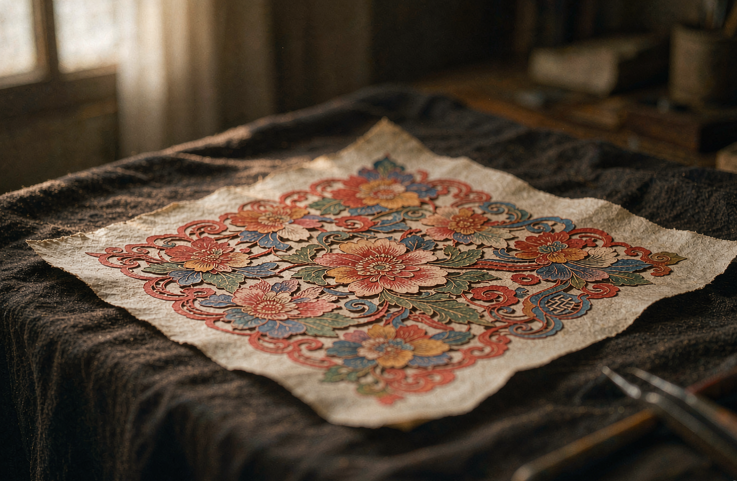
一张蔚县剪纸,彩色的刻刀活
严选录这一期看一张不太一样的剪纸:它不用剪刀,用刻刀;不止红色,还带着点染出来的粉与绿。河北张家口蔚县的剪纸,是剪纸大家族里"反着来"的一支——别处以剪为主、以红为正,蔚县以刻代剪、以点彩上色。说到底,这两个"反着来"的本质,是蔚县人把剪纸从窗前的女红,做成了作坊里的分工手艺:看懂了这一点,才算看懂了这张纸。
韵和鸣 · 2026/10/13 · 10 阅读
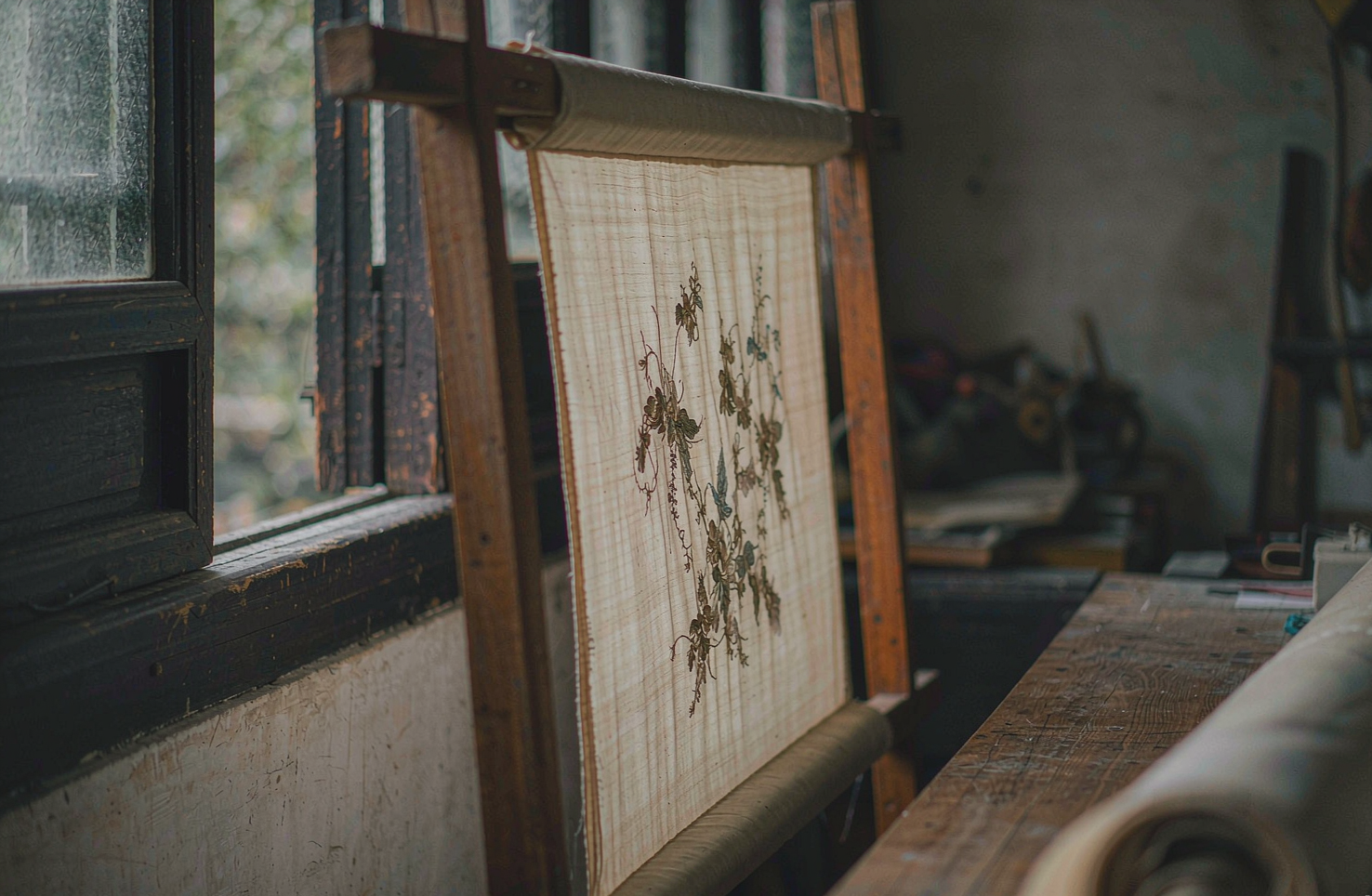
一枚苏绣绣片,丝光里藏着多少根丝
看一枚巴掌大的苏绣绣片,凑近了看,再凑近一点。你会发现它的光不是绣上去的,是"长"出来的——丝被劈到几乎看不见,一针一针顺着一个方向排,光就顺着丝走。说到底,苏绣的讲究,是从把一根丝线"拆开"那一刻开始的。
韵和鸣 · 2026/10/11 · 10 阅读
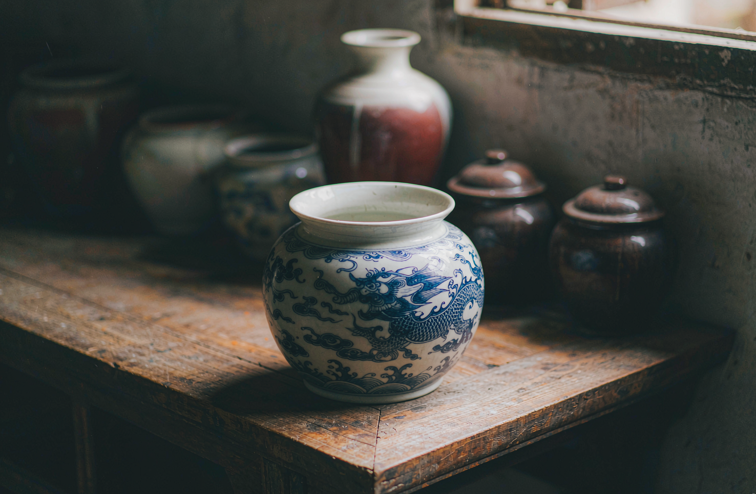
一盏博山琉璃:颜色是炉火给的,不是颜料调的
说到底,琉璃与玻璃的分界,不在透明不透明,而在颜色从哪来。在山东博山,一盏鸡油黄琉璃的颜色长在料里、生在炉里,出炉之后再不改色。这是严选录这一期想讲清楚的事。
韵和鸣 · 2026/10/12 · 9 阅读